This week we were contacted by someone far more adept at spreadsheets. So redoing our figures just got easier, we now have a fairly good overview of the national picture and can soon update our county pages.
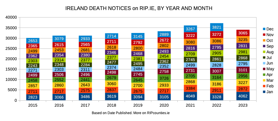
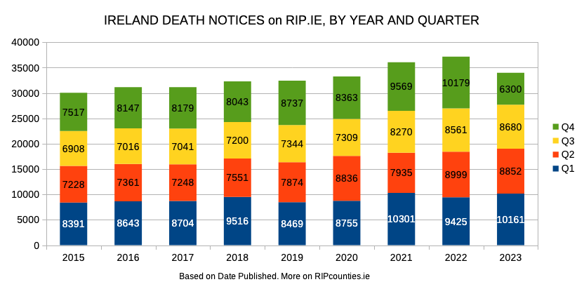
Meanwhile here are our numbers for the country.
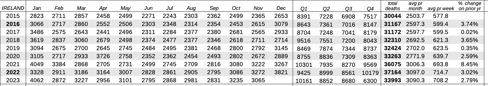
Keep in mind that, as we each use different methods of gathering, cleaning and processing our data, there will be slight differences1To date the biggest difference we’ve noted is about 1% and for 2016 only. All other years we tend to be within 0.01% and 0.5% of each other. between our figures and those of Ireland Excess Deaths and Irish Quislings.
But we’re each seeing the same trends.
Thankfully, while still well above what historical patterns suggest we should expect, November death notices on RIP.ie suggest an easing of the upward trend. We can see this in the average death notices per month and week.
- 1To date the biggest difference we’ve noted is about 1% and for 2016 only. All other years we tend to be within 0.01% and 0.5% of each other.
One reply on “Our latest national picture”
[…] Excess Deaths, Irish Quislings and RIP Counties each updated with their November numbers. Thankfully, this November seems less harsh than Nov […]